In the world of fashion, it is imperative to stay ahead of the trends, it's not enough to stay at steady pace with them anymore. That's why designers and major corporations in the fashion industry turn to forecasting companies to keep them up to date on this information. Pantone is the #1 color forecasting company there is, and the source to turn to for the color trends for the upcoming seasons. Pantone also releases this information to the general public as well, and thanks to them we have the Spring Color Trend Forecast for 2015. Let's take a look at the 10 colors for the spring season and see how some well known designers have incorporated these colors into their S/S 2015 Collections!
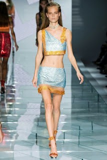 "Cool and calming, ethereal Aquamarine is a shade with a wet and watery feel. Open and expansive, this restful blue also acts as a stress reducer."
"Scuba Blue conveys a sense of carefree playfulness.Even though a cool shade, the vibrancy of Scuba Blue adds a splash of excitement to the palette. Scuba Blue offers a feeling of escape as it is reminiscent of a tropical ocean. This stirring and energizing shade takes us off to an exotic paradise that is pleasant and inviting, even if only a fantasy."
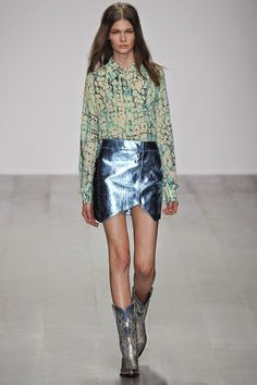 "Lucite Green is a soothing green shade whose time has really come again.Fresh and clarifying, cool and refreshing, Lucite Green has a minty glow. Light in weight and also in tone, Lucite Green seems almost transparent."
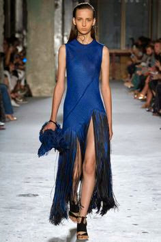
"Classic Blue inspires calm, confidence and harmony.Serving as an anchor to the Spring/Summer 2015 palette, Classic Blue is a shade that is strong and reliable. Just as with the sea, because of its waterborne qualities, this Classic Blue is perceived as thoughtful and introspective."
"Toasted Almond offers comforting warmth and is indicative of a spontaneous spring, summer feeling. Timeless and versatile, Toasted Almond is an organic shade that speaks to authenticity and all that is natural."
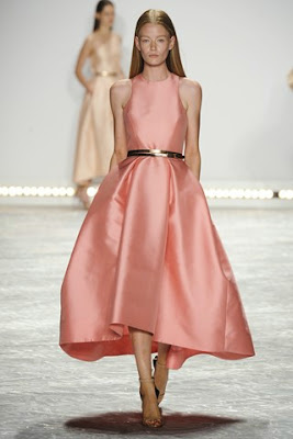
"Strawberry Ice is suggestive of a cooling and refreshing delicacy, yet its warmth as a color is quite appealing. Subtle and charming, Strawberry Ice is an ideal shade for Spring/Summer 2015. Both tasty and tasteful, Strawberry Ice is a confection color that evokes a feeling of being “in the pink,” emitting a flattering and healthy glow."
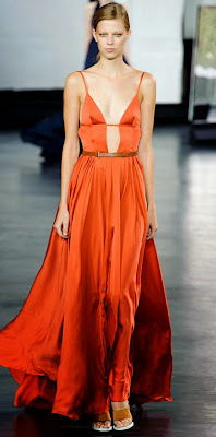
"Tangerine is a juicy orange shade that is energizing, yet not jarring to the eye. Versatile Tangerine is striking enough to stand on its own and adds vitality to a printed pattern. Good natured and friendly, but with a tangy edge, this fun-loving color invites a smile."
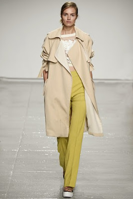
"Custard is a delicious and delectable yellow.Sweet and sunny, Custard is a cheering tone that brings thoughts of pleasant relaxation and comfort food. Engaging with its soft and mellow warmth and full of good feelings, subtle Custard has an affable and easy disposition."
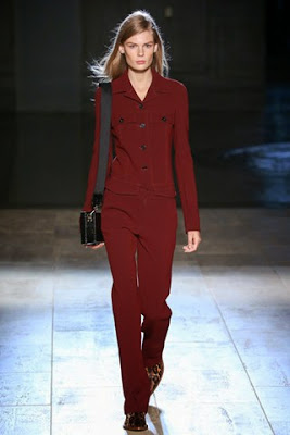
"Marsala serves as the foundation to the Spring/Summer 2015 palette. Sensual and bold, delicious Marsala is a daringly inviting tone that nurtures; exuding confidence and stability while feeding the body, mind and soul. Much like the fortified wine that gives Marsala its name, this robust shade incorporates the warmth and richness of a tastefully fulfilling meal, while its grounding red-brown roots point to a sophisticated, natural earthiness."
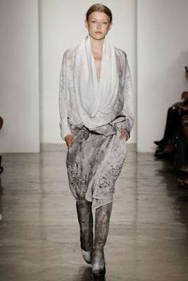
"Gray is an unobtrusive gray that contrasts and enhances; bouncing off other shades without taking away from them as it slips into the background to allow other colors to take center stage.Nature’s most perfect neutral, Glacier Gray is a shade that is timeless. Quietly assuring and peacefully relaxing, Glacier Gray, is above all, constant."










No comments
Post a Comment